Living Room Shelving That Doesn't Feel Heavy
Designing a custom media wall that balances storage, display, and architecture
A custom shelving wall should do more than hold a television.
It should organize daily life, display the objects that matter, and become part of the architecture of the home—not a piece of furniture that simply fills a wall.
For this young family's living room, the challenge wasn't creating more storage. It was creating a substantial built-in that still felt light, open and calm within one of the home's most important spaces.
The Challenge
The clients wanted a single wall to accomplish several jobs simultaneously.
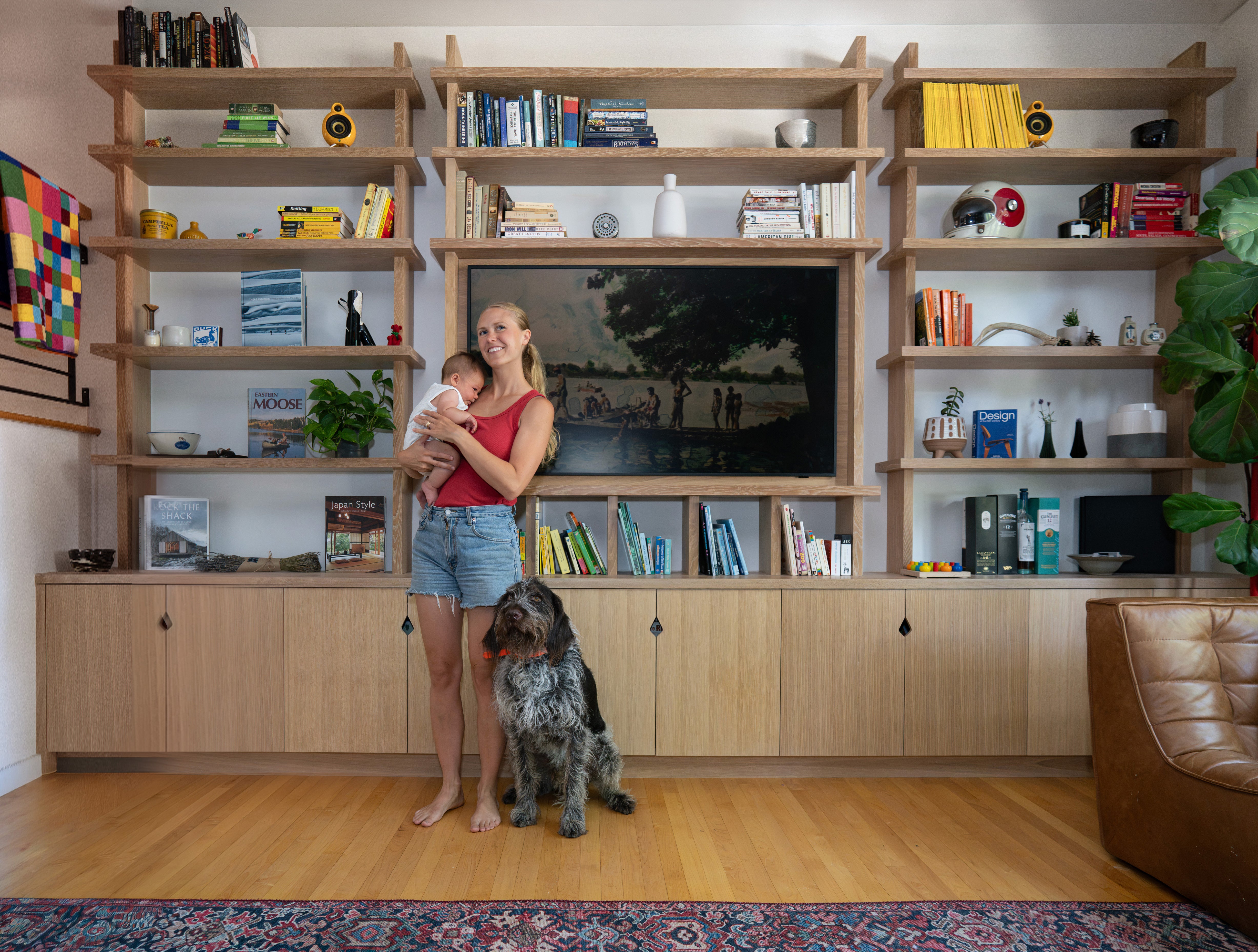
It needed to house the television, provide generous storage, display books, artwork and personal collections, and create a focal point for the living room.
The obvious solution would have been a continuous wall of cabinetry.
Instead, that became the problem.
A solid wall of cabinets would have visually reduced the room, competed with the natural light, and overwhelmed the open staircase that sits immediately beside it.
The goal became finding a way to build a very large piece of millwork that didn't feel visually heavy.
Designing Around the Room, Not Just the Wall
Every custom project begins with understanding how the room works before deciding what gets built.
This living room receives generous natural light and opens directly from the home's entry sequence. The shelving would become one of the first architectural elements visitors experience.
Rather than treating it as cabinetry, we approached it as part of the architecture itself.
The shelving needed to define the room without enclosing it.
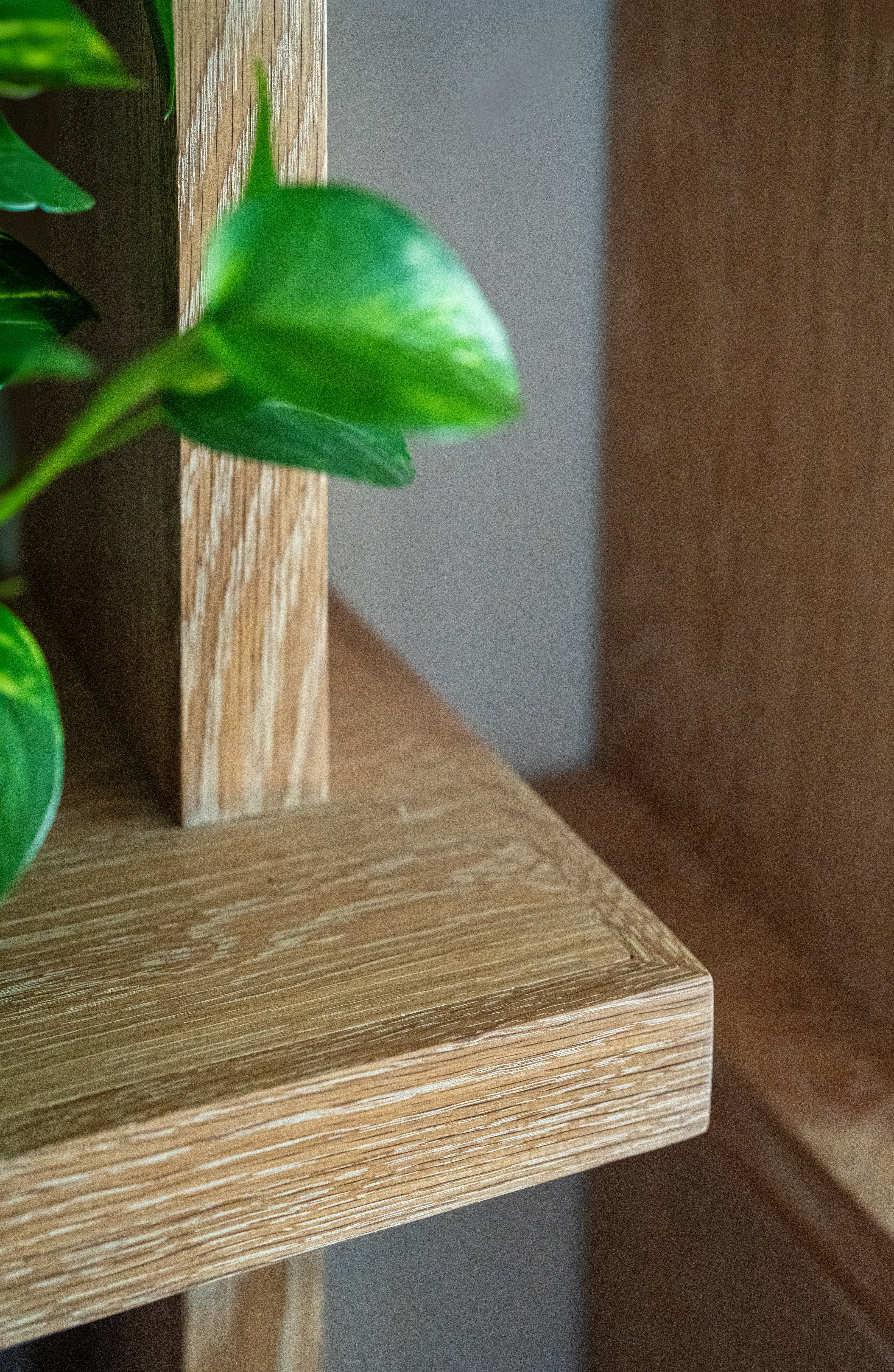

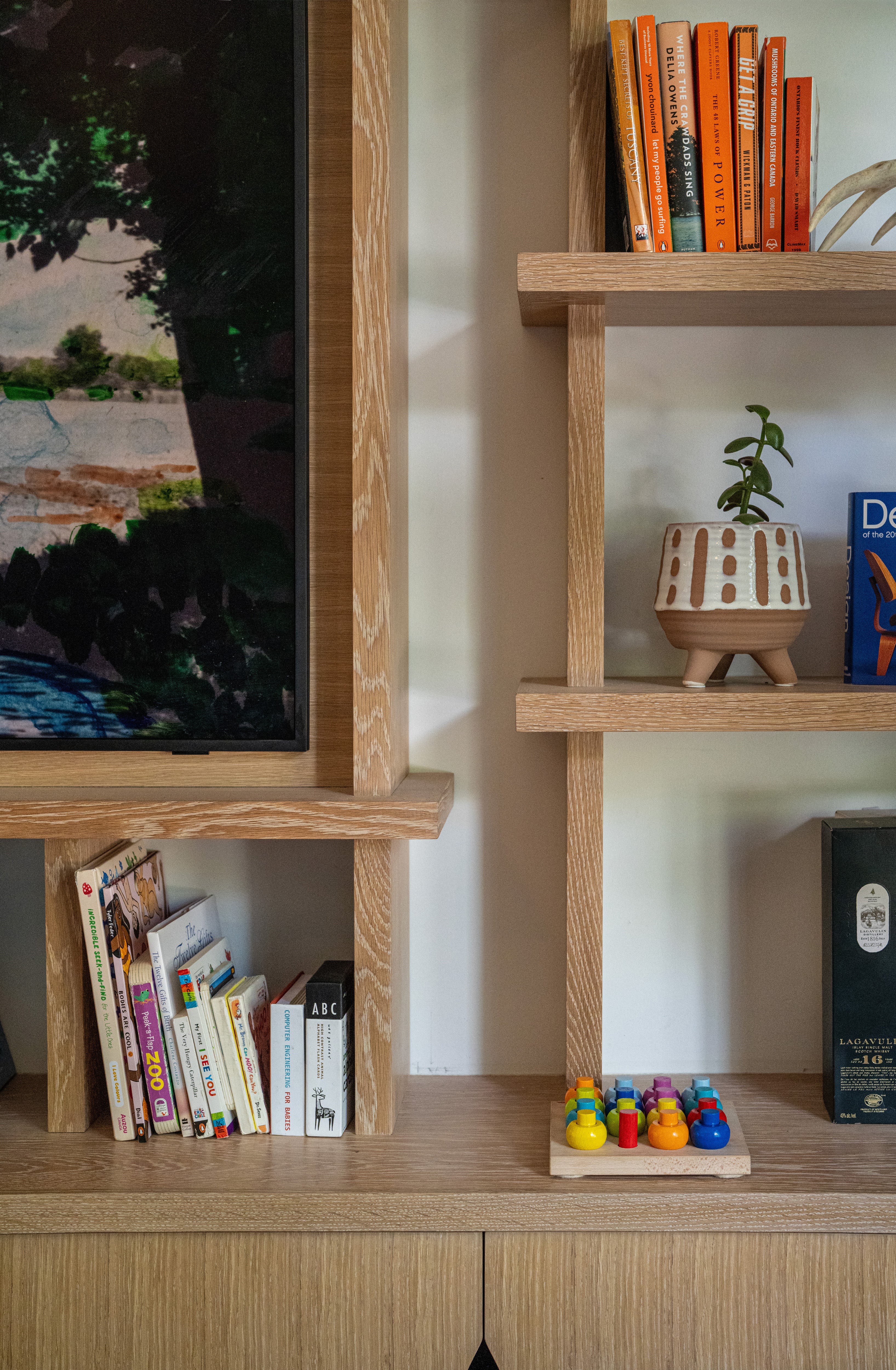
Creating Visual Weight Where It Belongs
The solution came through carefully balancing open and closed storage.
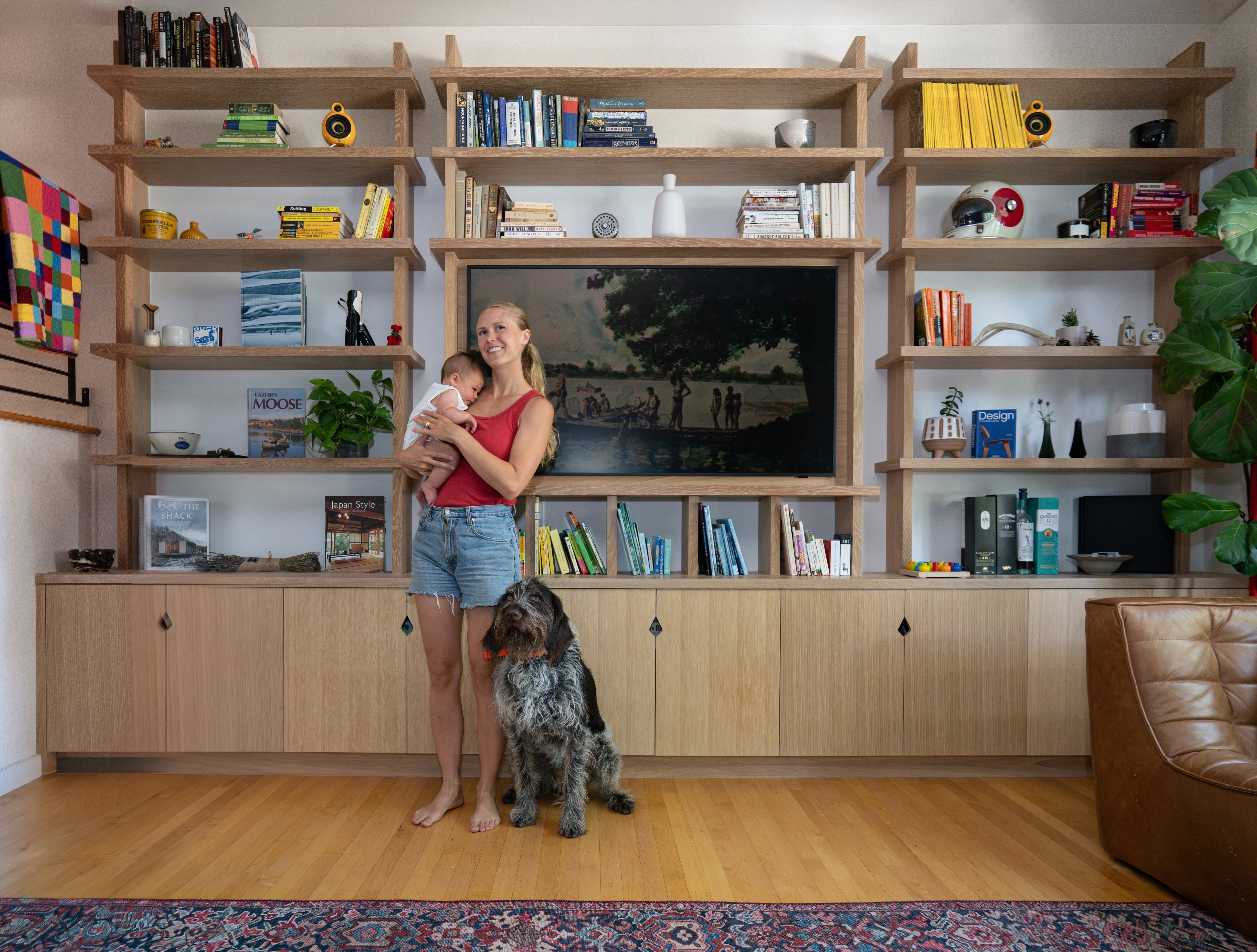
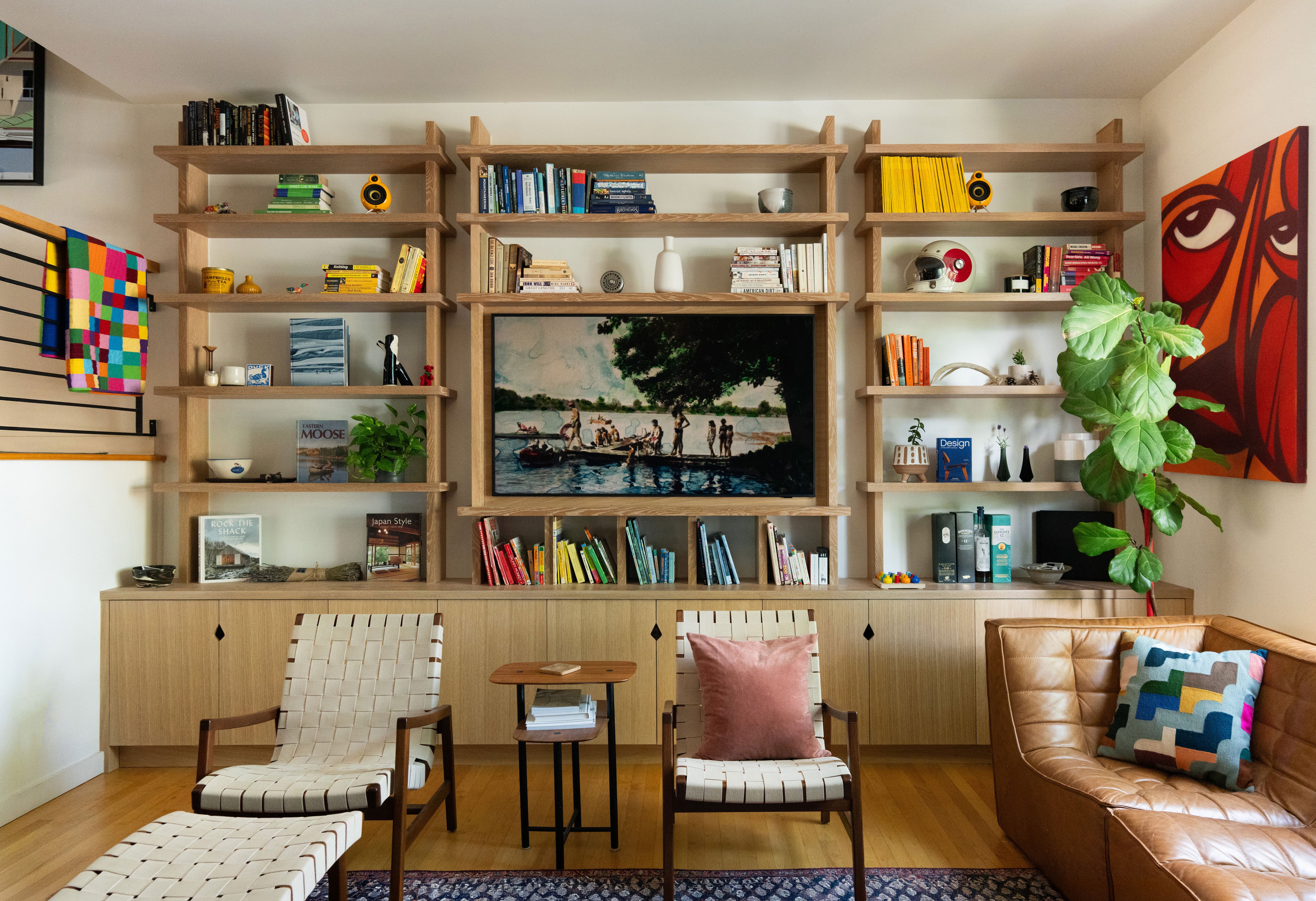
All of the lower cabinetry was designed as closed storage, allowing everyday items to disappear behind clean cabinet fronts.
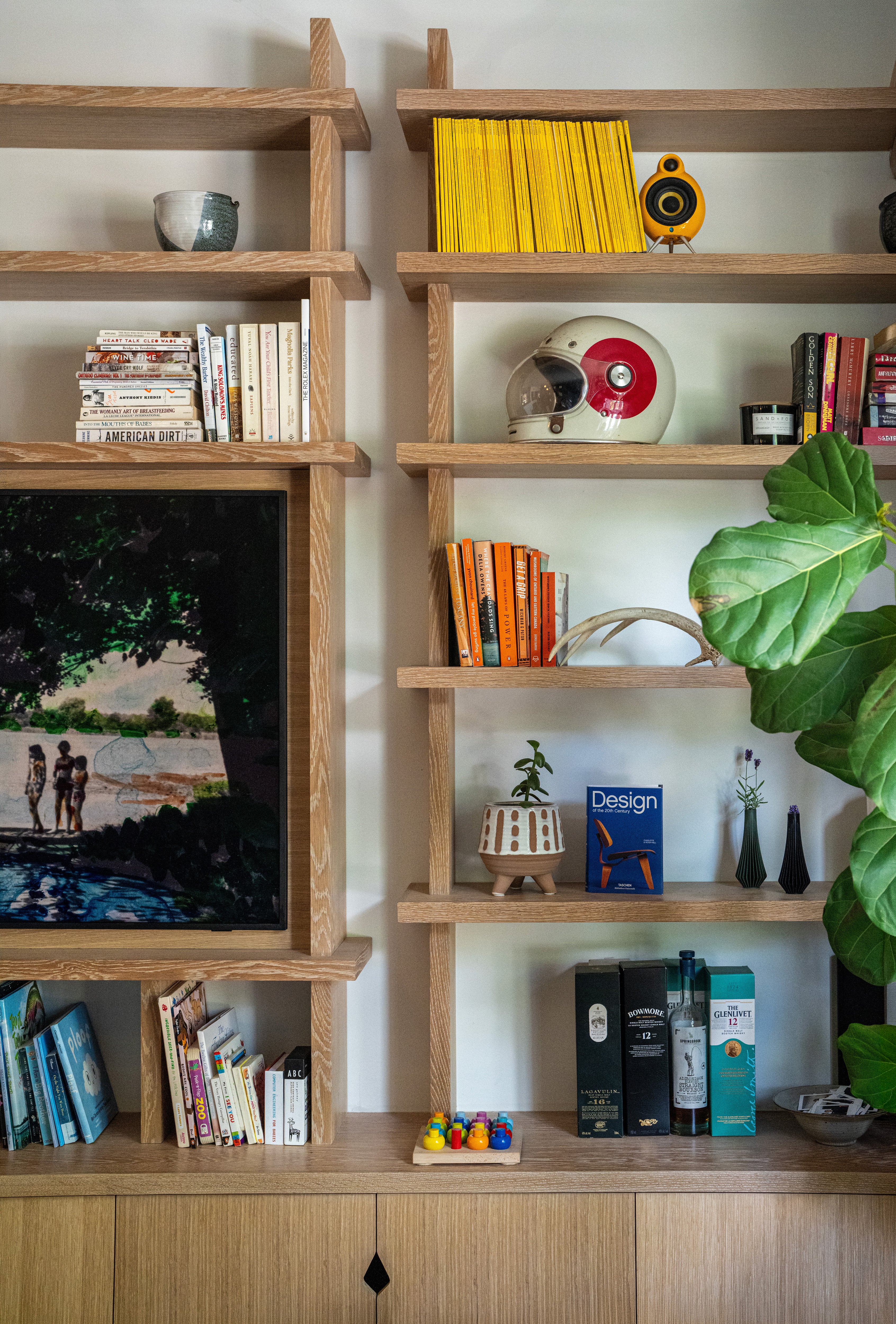
Above, the entire composition opens into exposed shelving.
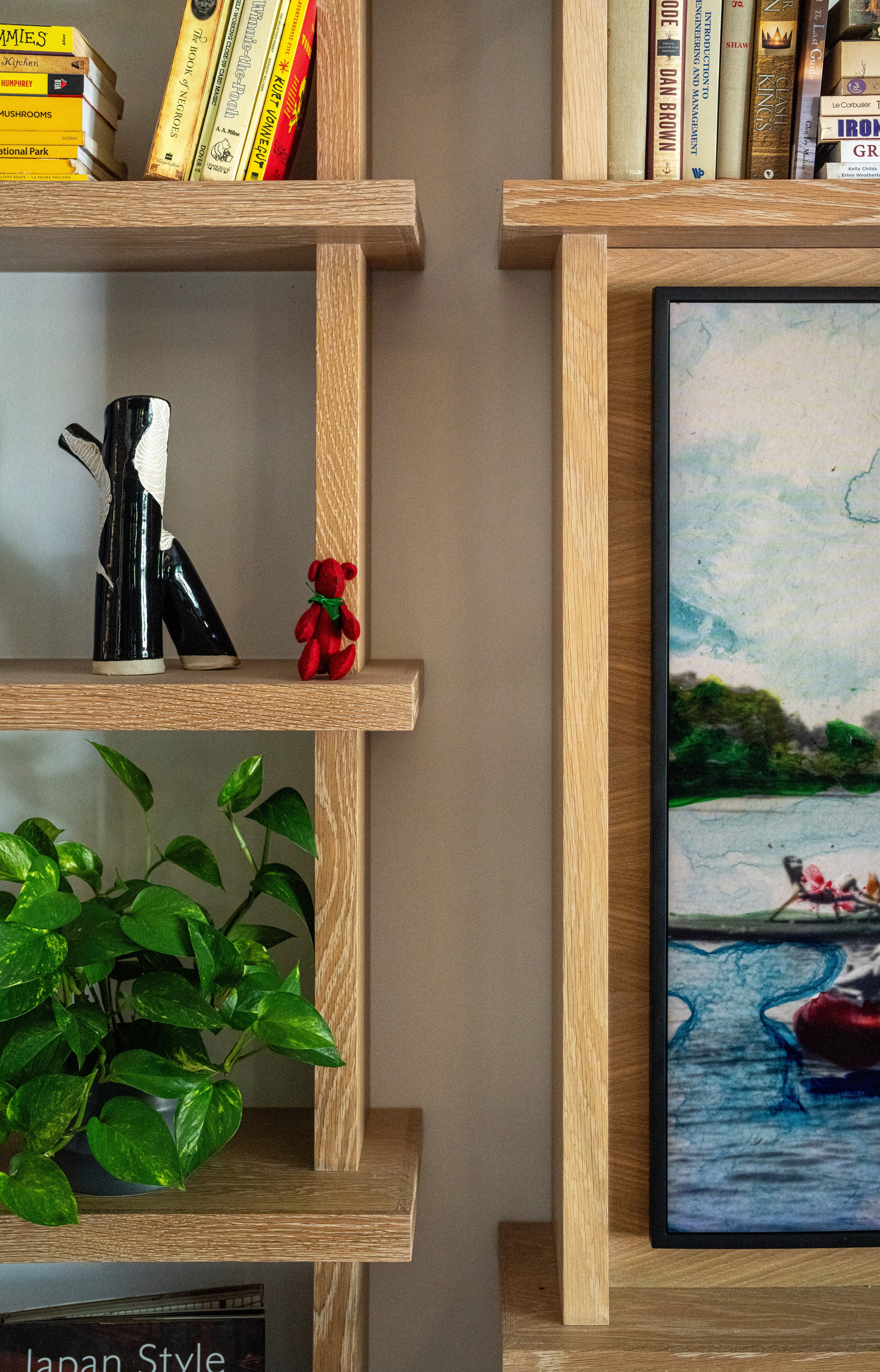
Rather than backing the shelves with wood panels, the shelving returns directly to the drywall, allowing the wall itself to remain visible throughout the composition.
That decision dramatically changes how the installation feels.
Instead of reading as one large cabinet, the eye continues through the shelving, allowing the architecture to remain present behind the millwork.
The result feels lighter despite occupying nearly the entire wall.
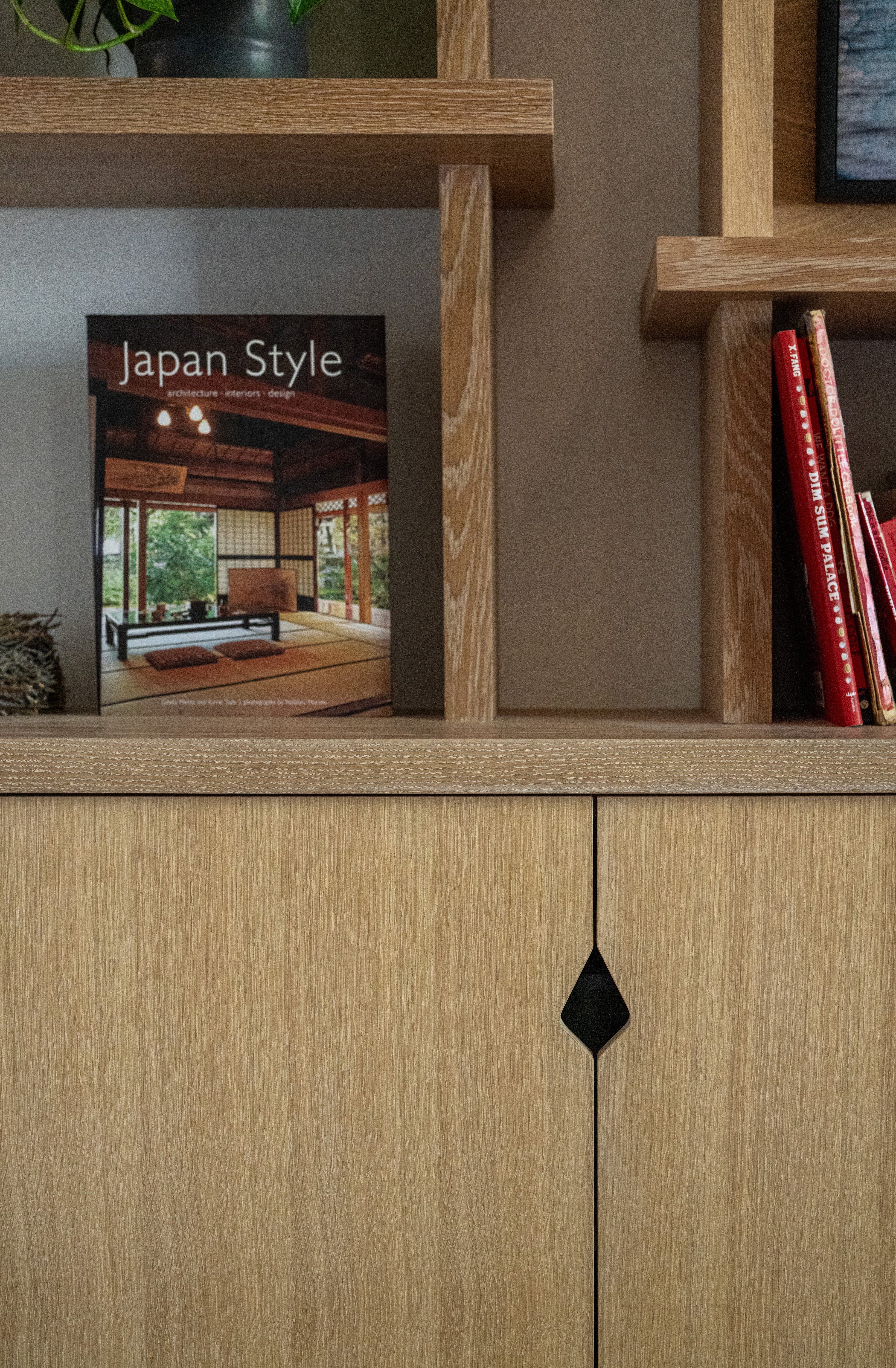
Engineering a Freestanding Shelf System
Leaving the wall visible introduced another challenge.
Without a full backing panel, every shelf had to become part of the structure itself.
The shelving system was engineered as a freestanding framework capable of supporting itself while maintaining clean proportions and precise alignment across the entire installation.
The structure becomes both the engineering solution and the visual language of the project.
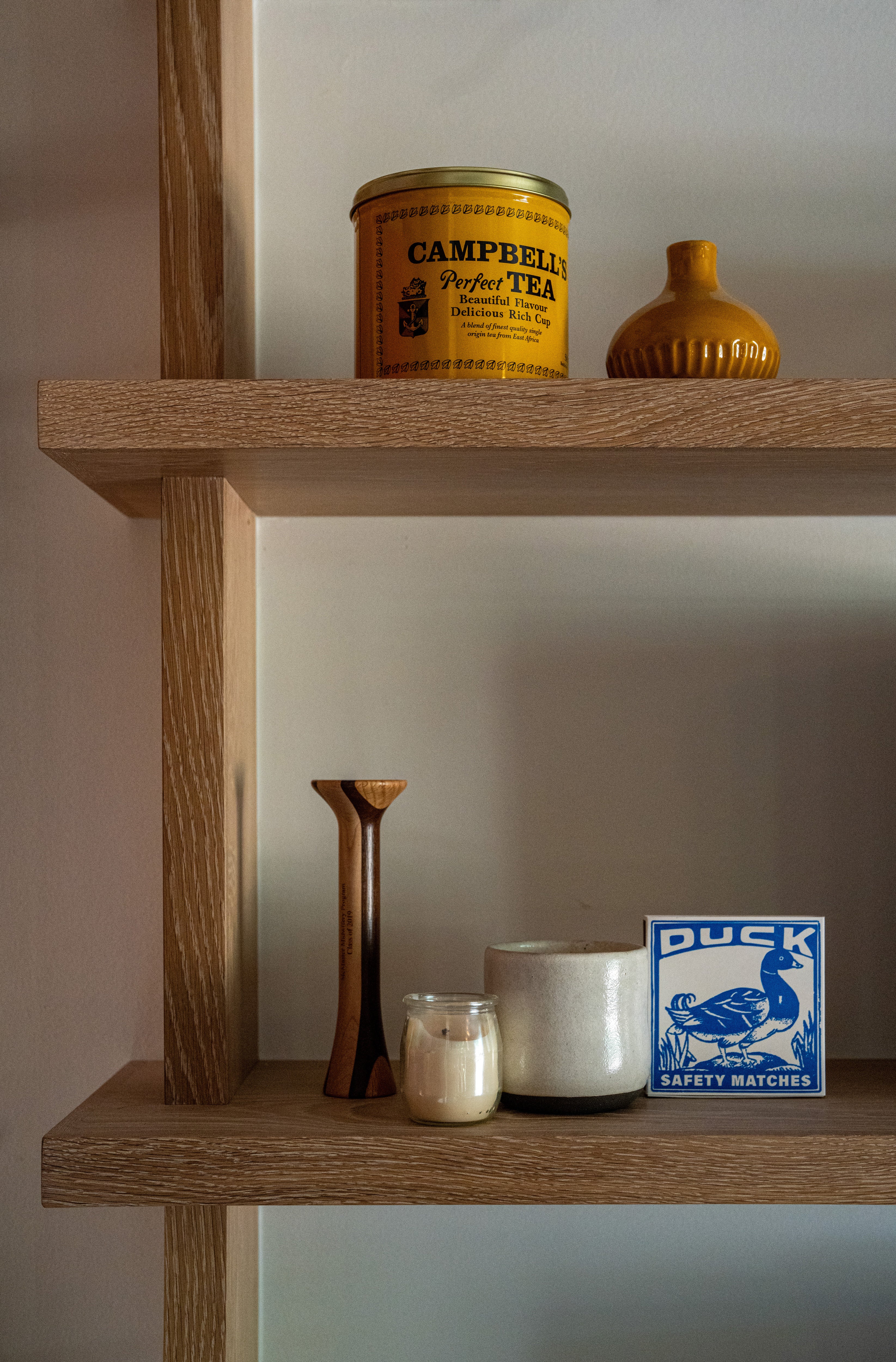
Referencing Rather Than Copying
The design draws subtle influence from both Japanese and Scandinavian furniture traditions.
Not through obvious stylistic references, but through restraint.
- Simple intersections.
- Confident proportions.
- Clean horizontal and vertical lines.
- Visible structure.
- Minimal visual noise.
Every Detail Serves a Purpose
Hardware became another opportunity to simplify.
Applied pulls would have introduced unnecessary visual interruptions across a wall nearly fourteen feet wide.
Rather than carving complex integrated handles, we developed a reductive diamond-shaped pull that is both functional and understated.
The opening provides a comfortable grip while maintaining uninterrupted cabinet faces.
Small decisions repeated across a large installation create visual calm.
Rather than reproducing a particular style, the project borrows principles that allow materials and proportion to become the primary design language.


Built for Everyday Living
The shelving wasn't designed as a showroom installation.
It was designed for a family.
- Books.
- Children's objects.
- Collected artwork.
- Photographs.
- Everyday storage.
- Technology.
Each element has a place, allowing the wall to evolve naturally as the family's life changes without losing its architectural clarity.
Solving Within a Real Budget
Every project has constraints.
In this case, budget became an important part of the design process.
Rather than reducing quality, the challenge became deciding where complexity created the greatest value.
By simplifying construction where appropriate and focusing craftsmanship on the areas people experience most directly, we created a wall that feels custom throughout while remaining within the client's investment range.
Good design is often the result of thoughtful decisions rather than additional complexity.
The Result
- The finished installation measures approximately fourteen feet wide by ten feet high.
- Despite its scale, it feels remarkably light.
- The room remains bright.
- The shelving frames the family's collections rather than competing with them.
- Storage disappears below.
- Display opens above.
- The architecture continues to breathe through the millwork.
- The project demonstrates a principle that guides much of our work:
The best custom millwork doesn't simply add storage. It solves problems while making the room itself feel better.



A focused two-hour consultation with principal designer Nicholas Holmes; ideal for clients planning custom millwork, built-ins, kitchen renovations, or bespoke furniture projects.
During this session, Nicholas will review your space, goals, and aesthetic direction. You’ll receive expert guidance along with a clear layout concept to help you understand how millwork or furniture will function within your home.
“Think of this as the sketch phase: we bring clarity to your space, needs, and vision, and you walk away with a usable layout and real next steps. The full consultation fee is credited toward your project when you move forward with Hamilton Holmes.”
Included in this consultation:
-
A two-hour on-site or virtual session
-
Review of your photos, measurements, drawings, and inspiration
-
Professional recommendations on layout, materials, finishes, and scope
-
Layout drawings to help visualize your design direction
-
A summary of next steps and feasibility considerations
-
The $1,200 consultation fee is credited toward your project if you proceed with Hamilton Holmes for millwork or fabrication
This consultation is designed to bring clarity and direction before entering a full design or build contract; whether you’re renovating, refining an idea, or starting a new project.